Table of Contents
You've just sat through a three-hour development review where the team agreed the feature was built exactly as specified. The problem? Half of it doesn't make sense to actual users.
Nobody wanted to build the wrong product. But the team jumped from static designs straight to code without ever putting something clickable in front of real people. By the time users tried it, changing things was too expensive to justify.
That gap between a design that looks right on screen and an experience that works for real users is exactly what prototyping in UX is built to close. A prototype lets you test how something behaves before anyone commits to building it.
In this guide, we'll cover what UX prototyping actually is, why it matters, the different types and fidelity levels, when NOT to prototype, how AI is reshaping the process in 2026, and a practical step-by-step you can follow regardless of your team size.
What Is Prototyping in UX?
UX prototyping is the process of creating an interactive, clickable simulation of a digital product before it is fully built. Unlike a static wireframe or mockup, a prototype allows users to tap, click, scroll, and navigate through it as if it were the real thing.
Think of it this way: if a UX wireframe is the floor plan of a building, a prototype is the furnished show apartment. It's not permanently built, but you can walk through every room, open every door, and decide whether it actually works for the people who'll live there before the walls go up.
Prototypes turn assumptions into evidence. Every interaction a user struggles with in a prototype is a problem you didn't have to pay a developer to fix.
Prototyping sits between wireframing and final development in the design process. It's the stage where structure meets behaviour and where most teams discover that what makes sense on a static screen doesn't always make sense to a real user in motion.
Why UX Prototyping Matters
The business case for prototyping is straightforward: it's far cheaper to fix a problem in a prototype than in a finished product. But the benefits go beyond cost savings.
It catches expensive problems early
Research consistently shows that companies prioritizing prototyping report up to a 50% improvement in onboarding speed and conversion rates. The reason is simple: teams that test interactions before building them ship products that work the way users expect, not the way designers assumed.
It makes stakeholder buy-in real
A static mockup asks stakeholders to imagine how the product will feel. A clickable prototype shows them. There's no misinterpretation of what's being built. Objections surface in a 30-minute review meeting instead of a post-launch retrospective. For B2B product teams managing multiple stakeholders, this alone justifies the prototyping investment.
It bridges the gap between design and development
A well-built prototype communicates interaction states, transitions, and edge cases that a static design file never can. Developers can see exactly how a dropdown behaves on error, what a loading skeleton looks like, and how an empty state should read. This directly reduces back-and-forth during development and improves the quality of the final build. It also connects naturally to your design system, where component behaviour should already be defined before prototyping begins.

Types of UX Prototypes
The type of prototype you build should match the question you're trying to answer. Using the wrong fidelity at the wrong stage is one of the most common ways teams waste prototyping effort.
Lo-Fi Prototypes (Paper & Basic Digital)
Lo-fi prototypes are the fastest and most cost-effective form of prototyping Paper prototypes are hand-drawn screens shuffled to simulate flow, a user points to where they'd tap, and the designer swaps to the next card. Basic digital lo-fi prototypes use linked wireframe screens with no animation or polish.
The point isn't fidelity, it's speed. A paper prototype session with five users takes an afternoon and surfaces the biggest structural problems before any digital work begins.
- Best for: Validating core user flows and navigation structure early
- Tools: Pen and paper, Marvel, Figma with basic links
Mid-Fi Prototypes (Interactive Wireframes)
The most commonly used prototype type in professional UX work. Mid-fi prototypes have real labels, clickable buttons, and navigable flows, but no final visual design. They're specific enough to run meaningful usability tests without the overhead of hi-fi production.
For most B2B product teams, this is where the user journey map becomes a prototype. Each stage of the mapped journey gets a screen, each screen gets interactions, and the whole flow gets tested as a connected experience.
- Best for: Usability testing, stakeholder alignment, dev handoff scoping
- Tools: Figma, Axure RP, UXPin
Hi-Fi Prototypes (Near-Production)
Hi-fi prototypes are polished, realistic, and highly interactive, complete with final typography, transitions, micro-interactions, and sometimes real data. They're nearly indistinguishable from the working product and are most valuable immediately before development begins.
Hi-fi prototypes are the most expensive to build and should be reserved for moments where stakeholder approval or investor presentation requires near-production quality. Using them too early in the process is a common and costly mistake.
- Best for: Final usability validation, client sign-off, developer handoff
- Tools: Figma, ProtoPie, Framer, Axure

Prototyping vs Wireframing: Key Differences
These two are often conflated, and confusing them leads to using the wrong tool at the wrong stage. Here's a clear side-by-side. For a deeper look at wireframing, read our full guide on UX wireframes.
| Dimension | UX Wireframe | UX Prototype |
|---|---|---|
| Purpose | Define structure & layout | Test interactions & user flows |
| Fidelity | Low to mid - no styling | Mid to high, clickable & realistic |
| Interactivity | Static blueprint | Clickable, animated, interactive |
| Used when | Before design decisions are made | After the structure is agreed upon |
| Tests for | Layout logic & content hierarchy | Usability, flow, and behaviour |
| Typical tool | Figma (lo/mid-fi), pen & paper | Figma, ProtoPie, Axure, Framer |
The practical sequence: wireframe first to agree on structure, prototype next to validate behaviour. Teams that prototype before wireframing burn time on interactions in a layout that hasn't been validated. Teams that wireframe without ever prototyping ship flows that made sense on paper but break down in real use.
How to Create a UX Prototype: Step-by-Step
Step 1: Define what you're testing
Before opening any tool, write one sentence: 'We are testing whether users can [complete X task] without assistance.' A prototype without a clear test objective is just a design deliverable. Know the question before you build the answer.
Step 2: Choose your fidelity level
Match fidelity to your stage. Early discovery → lo-fi. Structure approved → mid-fi. Final validation before build → hi-fi. The most common mistake is jumping to hi-fi because it "looks more professional". Fidelity should match what the test requires, not what impresses a meeting room.
Step 3: Build your screens and connect them
Create each key screen in your tool, then link every interactive element: buttons, navigation, form submissions, and error states. A prototype that only works on the happy path will only test the happy path. Include empty states, loading screens, and error messages from the start.
Step 4: Add realistic interactions
Transitions, hover states, and micro-interactions aren't just polish; they change how users perceive flow. A button that responds immediately feels different to a user than one with a 200ms transition. Add enough interaction realism to make user behaviour authentic, but don't over-engineer animations that don't exist in the real product yet.
Step 5: Test with 5 real users
Run moderated usability sessions, share the prototype, give users a specific task, and observe without guiding. Studies show that UX prototyping reduces rework in development by 40–60%. The majority of that saving comes from issues found in these sessions, not in design reviews or internal walkthroughs.
Step 6: Iterate and hand off
Update the prototype based on test findings. Run one more lightweight test if major changes were made. Then prepare for developer handoff: annotate every interaction state, export design specs, and walk the engineering team through the prototype live, don't just share a link and hope for the best.

Stuck between wireframes and prototypes, and not sure which stage you actually need? Anarish runs structured UX discovery sprints that take B2B product teams from research to tested prototypes in two weeks. → Book a call at anarish
When NOT to Prototype
Prototyping is powerful. It's not always necessary. Knowing when to skip it saves real time without adding real risk.
Skip prototyping when you're making minor UI changes to a screen that has already been validated with users. A button label change, a spacing adjustment, or a colour update doesn't need a prototype. Similarly, if you're working within a mature design system and the interaction pattern already exists and has been tested, reference the pattern instead of rebuilding the prototype from scratch.
Also, skip it when the timeline pressure is extreme, and the flow is simple. A three-screen linear flow with no conditional logic, like a basic form submission, can often be communicated through annotated wireframes and a developer walkthrough. A prototype here would cost more time than the risk it mitigates.
Prototype when the interaction is complex, the stakes are high, or the team disagrees about how it should feel. Don't prototype out of habit, prototype out of purpose.
AI Prototyping in 2026: What's Changed
AI hasn't replaced UX prototyping, but it has changed what the first hour of prototyping looks like. In 2026, most AI prototype generators were experimental. In 2026, several are genuinely useful in specific parts of the workflow.
What AI prototyping tools do well today:
- Generate multiple screen layout options from a text prompt in seconds, useful for lo-fi ideation when you need to explore 4–5 concepts without building each by hand
- Convert a sketch or screenshot into a linked digital prototype. Uizard and Visily both do this reliably now
- Produce multi-screen connected flows from a described user goal, not just individual screens
- Suggest interaction patterns based on the app type, e-commerce, SaaS dashboard, and onboarding flow, reducing the time spent on structural decisions
Leading tools in 2026: Figma AI Draft, UX Pilot (Figma plugin), Uizard, Visily, and Framer AI for code-based prototypes. For B2B teams using Figma, AI Draft is the lowest-friction entry point. It lives inside your existing workflow.
What AI cannot do yet: understand your specific users, make strategic decisions about which flows to prioritize, or catch the nuanced usability issues that only surface when real people attempt real tasks. Use AI to accelerate lo-fi ideation. Use your UX expertise for everything that follows. See more on this in our post on AI tools for UX design.

Best UX Prototyping Tools in 2026
| Tool | Best For | Why Teams Use It | Pricing |
|---|---|---|---|
| Figma | All fidelity levels | One platform from lo-fi to handoff; AI Draft | Free / from ₹800/mo |
| ProtoPie | Advanced interactions | Sensor-based, physics animations, device preview | From $13/mo |
| Axure RP | Complex B2B flows | Conditional logic, dynamic content, data-driven | From $25/mo |
| Framer | Hi-fi + code | Real-code components; publish directly to the web | Free / from $5/mo |
| Marvel | Fast lo-fi testing | Sketch → clickable prototype in minutes | Free / from $12/mo |
| UXPin | Dev-ready output | React component-backed prototypes | From $19/mo |
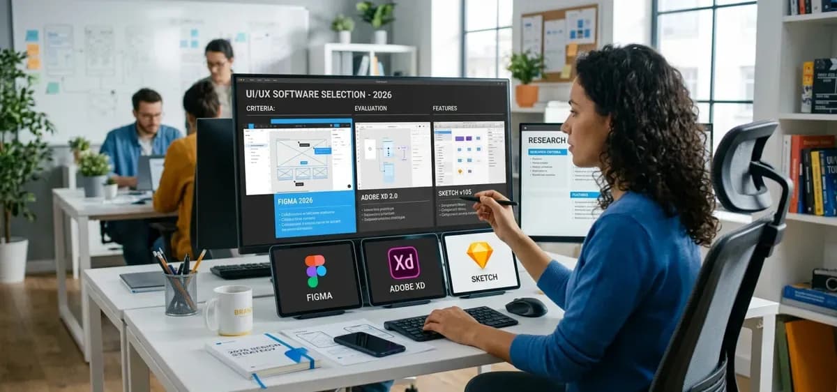
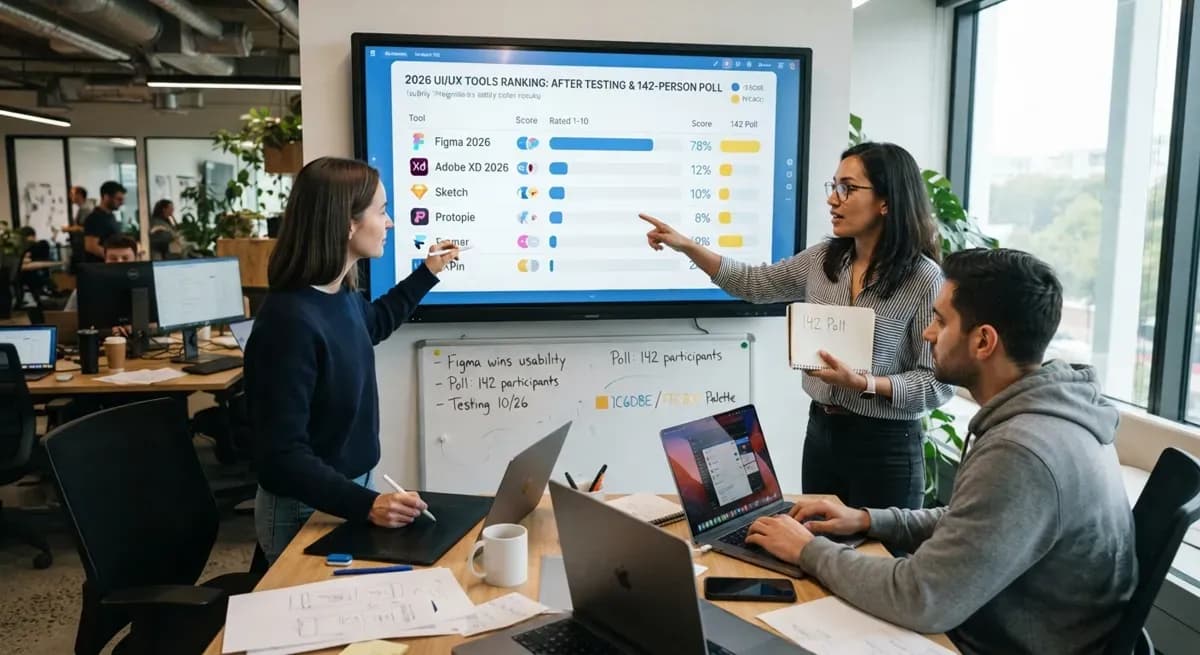
For most B2B product and design teams, Figma is the right default; it handles everything from lo-fi through hi-fi, integrates with your design system, and produces developer-ready specs without switching tools. If your product involves complex conditional logic or enterprise-level flows, Axure RP earns its steeper learning curve. For advanced micro-interactions and animations, ProtoPie is unmatched.
Common UX Prototyping Mistakes to Avoid
Prototyping the happy path only
A prototype that only works when everything goes right will only reveal problems when everything goes right. Empty states, error messages, loading screens, and edge cases must be built into the prototype from the start. Users will find these paths in testing, and it's far better to find them in Figma than in production.
Using hi-fi too early
High-fidelity prototypes take significant time to build. Using them to validate structural decisions that a lo-fi prototype could have caught in an afternoon is one of the most common ways UX projects overrun. Save hi-fi for final validation and developer handoff, not for early discovery. This is the same principle behind starting with lo-fi wireframes before moving to high-fidelity layouts.
Testing with the wrong people
Showing a prototype to your team, your CEO, or your most tech-savvy colleague is not a usability test. These people know the product, share your assumptions, and are unlikely to represent real user behaviour. Test with people who match your actual target user and watch what they do, not just what they say.
Final Thoughts
Every product problem we've ever fixed after launch could have been caught before launch with a prototype. That's not an exaggeration; it's the honest pattern that emerges when you look back at where things went wrong. A user taps the wrong button, abandons an onboarding flow, or submits a form that confirms nothing. Those moments aren't bugs. They're design decisions that were never tested.
Prototyping in UX is not a formality and it's not a phase you graduate from once you're experienced. The best design teams we've seen from early-stage startups to enterprise B2B product organisations prototype more, not less, as they scale. Because the cost of a wrong assumption scales with the size of your codebase.
Start with paper if you need to. Test with five users before you get attached to anything. And never ship a user flow you haven't watched a real person try to complete. The prototype is how you earn that confidence.
Ready to validate your product before development begins? Anarish builds and tests UX prototypes for B2B product teams from lo-fi concept to hi-fi developer handoff. → Explore our work at portfolio | Talk to us at At Anarish
.png&w=640&q=75)